dorset_covid
Covid data insights
This page shows a number of data plots that are updated less regularly, either because I have produced them to illustrate a particular point in time, or because the data is released irregularly or requires manual processing.
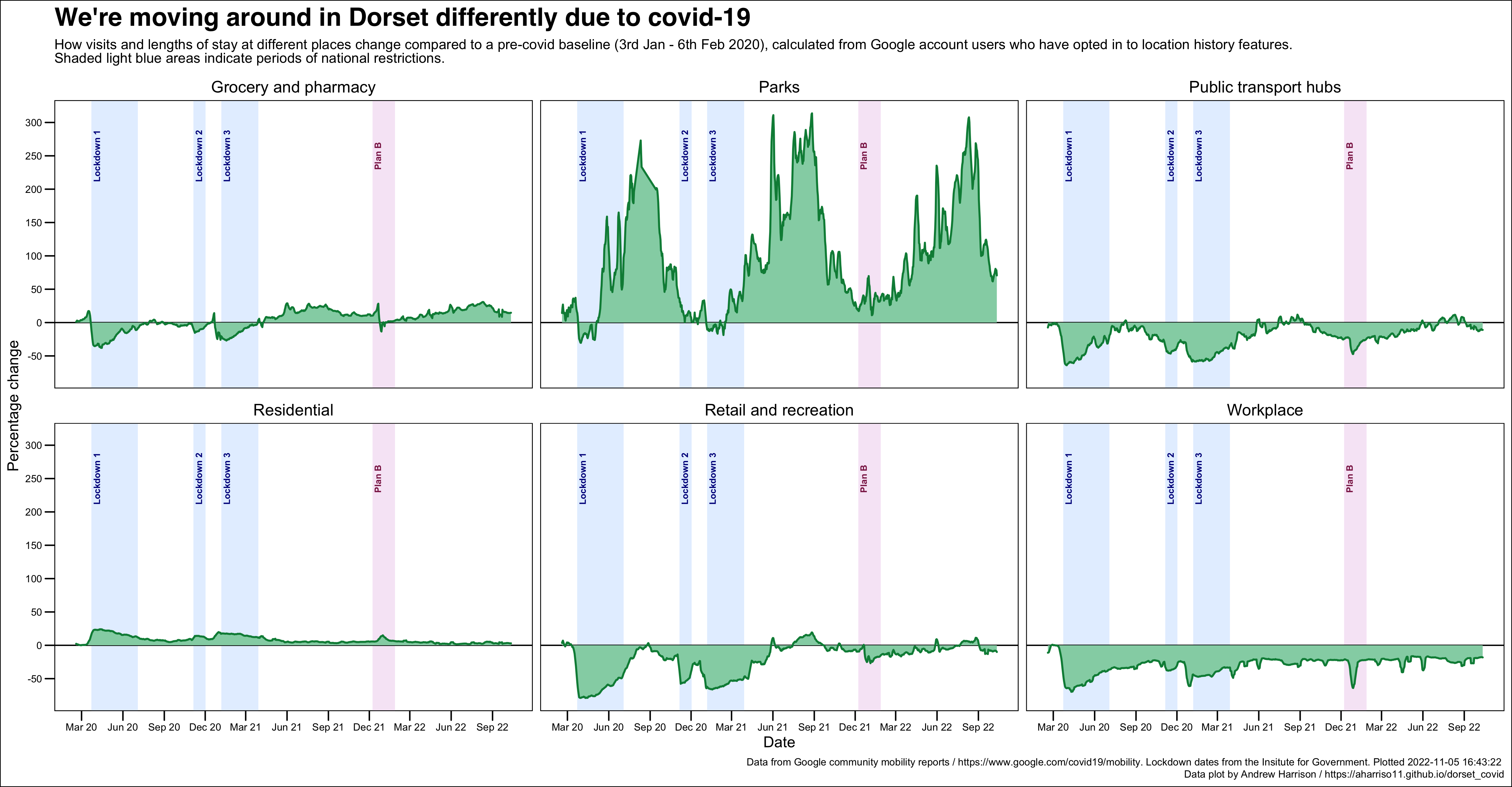
Google community mobility data
This data set is made available by Google at https://www.google.com/covid19/mobility/. It is a release of aggregated, anonymised data showing how mobility behaviour among mobile device users is changing in comparison to a pre-covid baseline that was taken in January and February 2020.
The data are taken from Google account users who have chosen to enable the location history settings within their account. The same functionality is also used to provide the popular times and live visit data you may be familiar with seeing in Google Maps.
Google publish country level summaries of this data on their website but make more detailed data, down to local authority level, available for research and public health purposes. I have used the data set for Dorset only to present a multi-faceted graph showing how mobility has changed across the six main location categories. They show:
- our visits to grocery and pharmacy premises sharply declined at the start of each lockdown, but eventually recovered and through much of 2021 were above the baseline figure;
- we’ve been spending far more time in our parks and open spaces, although this is very weather dependent and tails off noticeably over winter;
- our use of public transport has stayed below the baseline for most of the period, and has only recently risen above the baseline;
- unsurprisingly, we’ve all been spending more time at home - a pattern that has been maintained through the period;
- retail and recreation visits stayed below the baseline apart from a brief period in summer 2021 and a more prolonged period in summer 2021, and has only recently risen above the baseline;
- we’ve spent a lot less time in the workplace, something that has been maintained since the start of covid.
View the underlying code that produces this plot
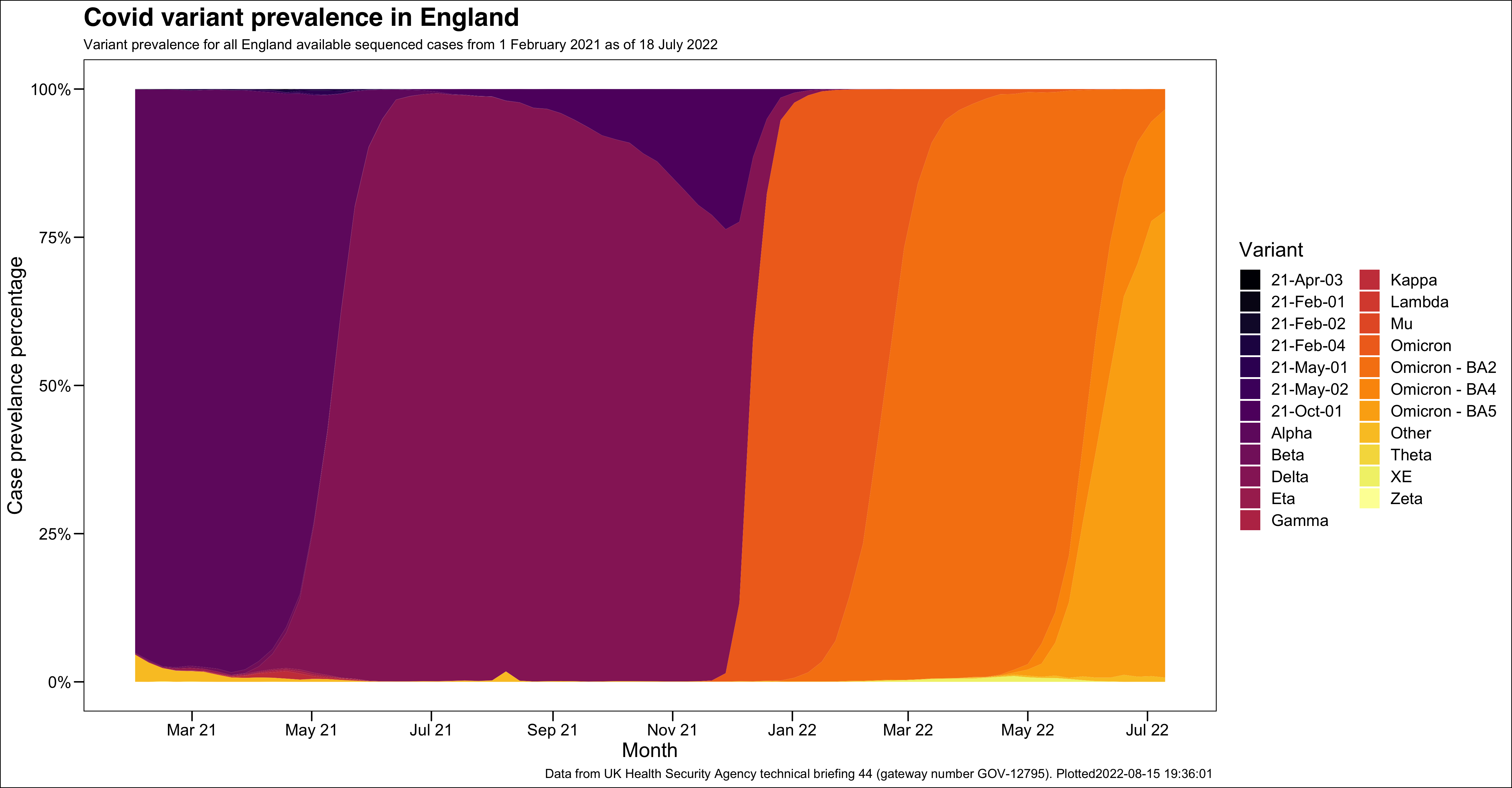
Covid variant prevalence
This data set is made available by the UK Health Security Agency as part of their covid technical briefings. These briefings are released fairly frequently but on an irregular basis. The most recent briefing (number 44) was released on 22nd July 2022 and provides information on cases sequenced between 1st February 2021 and 18th July 2022.
The variant prevalence data set shows the overwhelming prevalence of the Alpha “Kent” variant throughout the winter of 2020 and into spring of 2021, whereupon it is quickly edged out by the Delta variant through May and June. The Omicron variant appears in late November and quickly edges out the Delta variant. More recently, growth of the BA2, BA4 and BA5 variants can also be seen.
View the underlying code that produces this plot
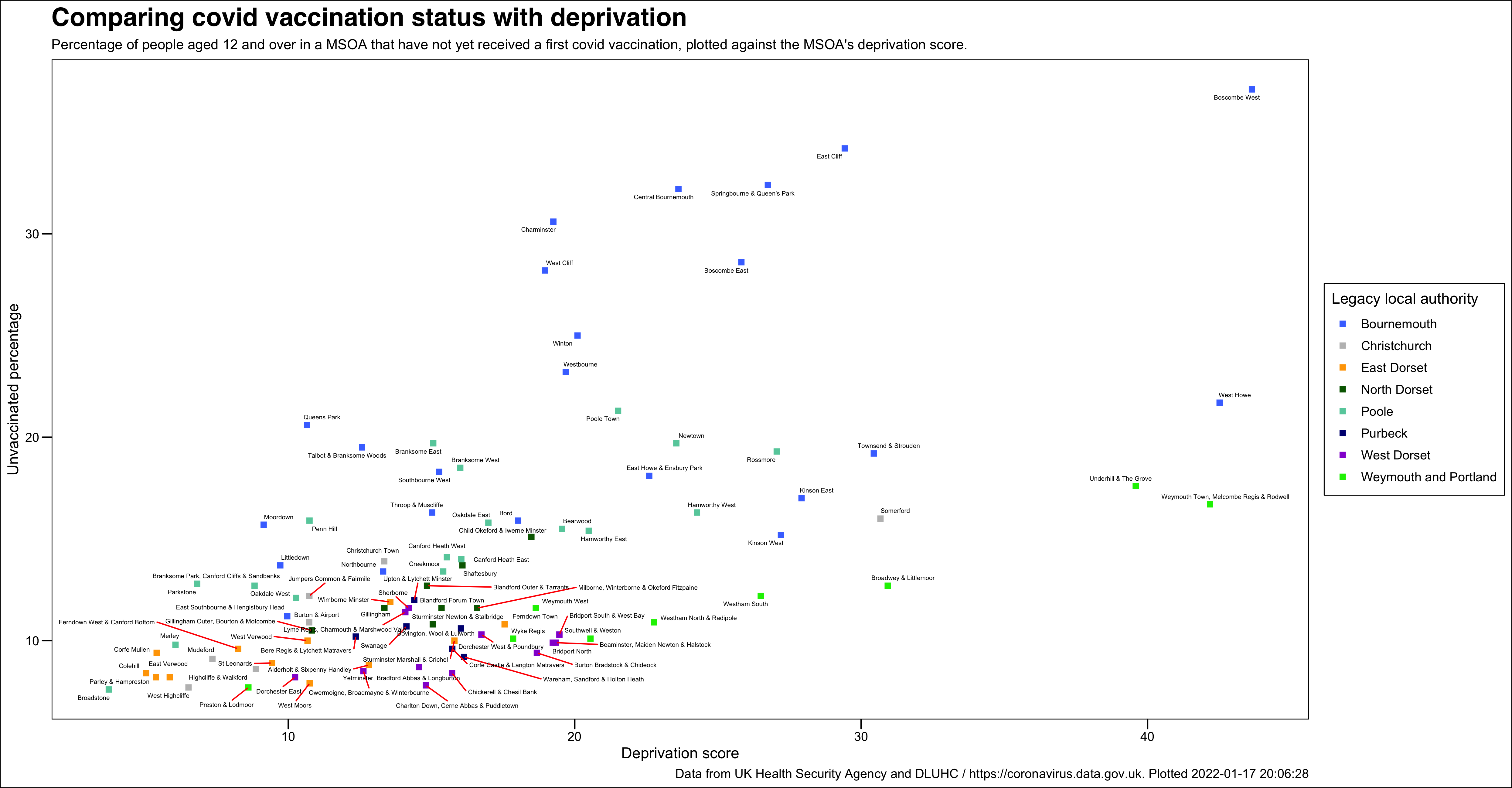
A comparison of covid vaccination status with deprivation
This data plot combines two data sets: the percentage of people who have not yet received a first covid vaccination, plotted against the index of multiple deprivations score in their area. The data plot shows:
- most areas in Dorset are well vaccinated, with only outliers above roughly twenty per cent
- the least vaccinated areas are all in Bournemouth
- the least vaccinated areas all contain a transient cohort who may not enjoy family or wider societal links with the area in which they live, and may well not be registered with a GP practice;
- areas of comparatively high deprivation with more stable, family orientated communities in fact enjoy a vaccination profile that is not particularly unaligned with more affluent areas.
View the underlying code that produces this plot
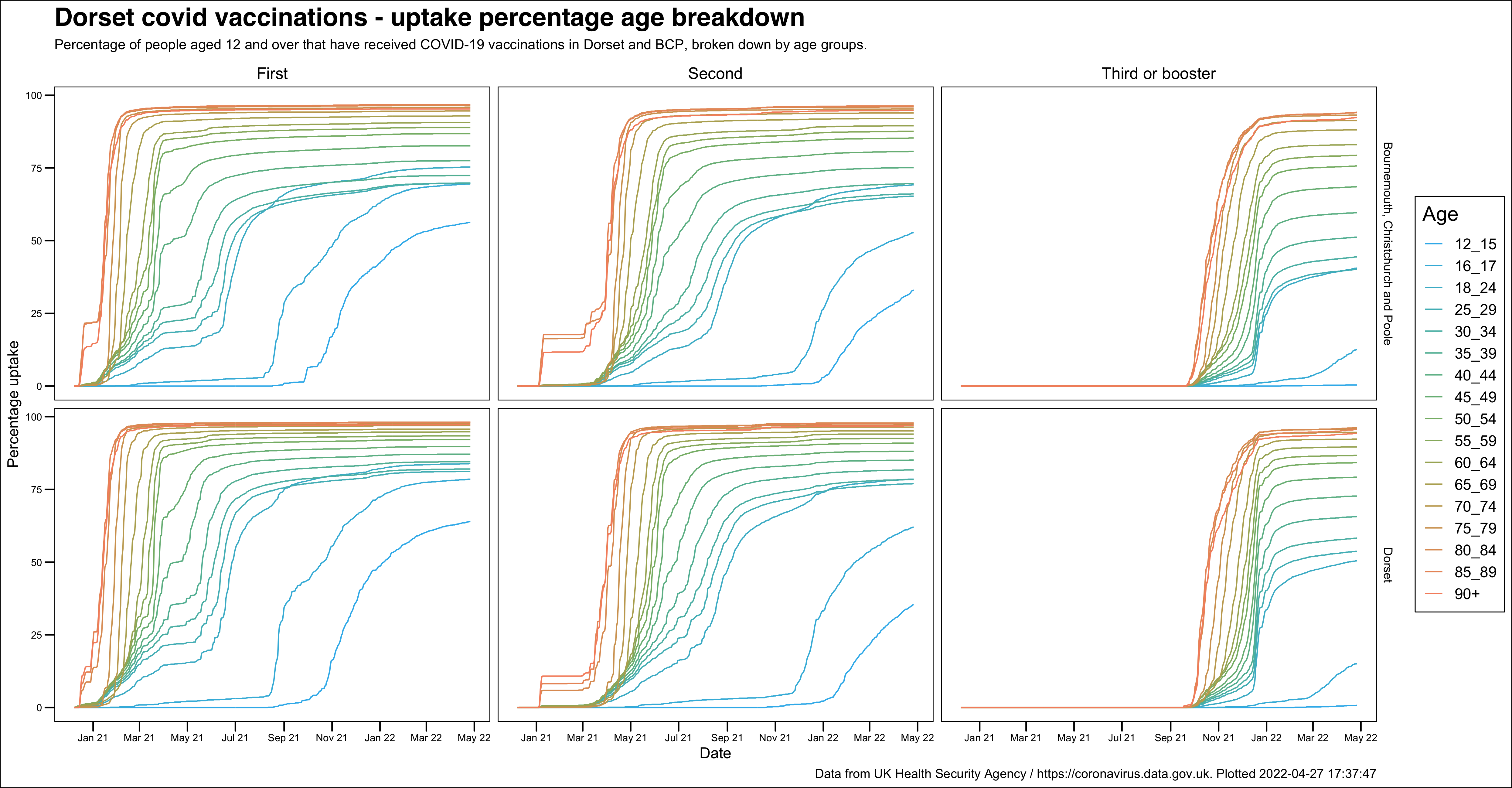
Vaccinations - uptake percentages broken down by age groups
This is another multi-facted chart that breaks down the percentage uptake for the first, second and third or booster vaccinations by both age group and local authority area. It is interesting to note that despite the slightly different uptake profile for Dorset and BCP, broadly the same patterns can be made out in both areas.