dorset_covid
Data plots last updated: 2023-03-23
Andrew’s Dorset and BCP covid statistics
This page is now updated only periodically.
This is the output of me playing around with the R statistical programming language and the coronavirus data produced on a daily basis by the UK Health Security Agency (UKHSA) and published at https://coronavirus.data.gov.uk, focusing on the local authority areas of Dorset and Bournemouth, Christchurch and Poole.
I’m publishing these interpretations of data already in the public domain purely for my personal interest. They’re updated when I feel like it, and you should always check the dates on the data plots to see how old they are. To see the most up-to date information you should always check UKHSA’s dashboard at https://coronavirus.data.gov.uk. I am not a statistician or an epidemiologist, or any kind of expert in this field. This information is offered on a best endeavours basis for your own interest and you should not use it for any other purpose.
For authoritative information regarding the prevalence of covid-19 in Dorset or BCP you should visit the website of Public Health Dorset.
If you find these statistics of interest you may also enjoy my blog posts on generating the R code behind the England case rates plot, and the importance of working with ‘long data’ as opposed to ‘wide data’. You can also look at the underlying R source code at https://github.com/aharriso11/dorset_covid.
To see what’s changed on these pages visit the change log
You can see a larger version of each data plot by clicking on it.
International and insights
Other insights
A selection of other data insights, usually updated on an irregular basis, can be seen on a separate page. Other insights currently include data plots of covid variant prevalence in England, vaccination uptake by age for Dorset, and mobility data from Google for Dorset.
International comparison
An international comparison of cases and vaccinations per million between the UK and some other countries is available on a separate page.
Vaccinations
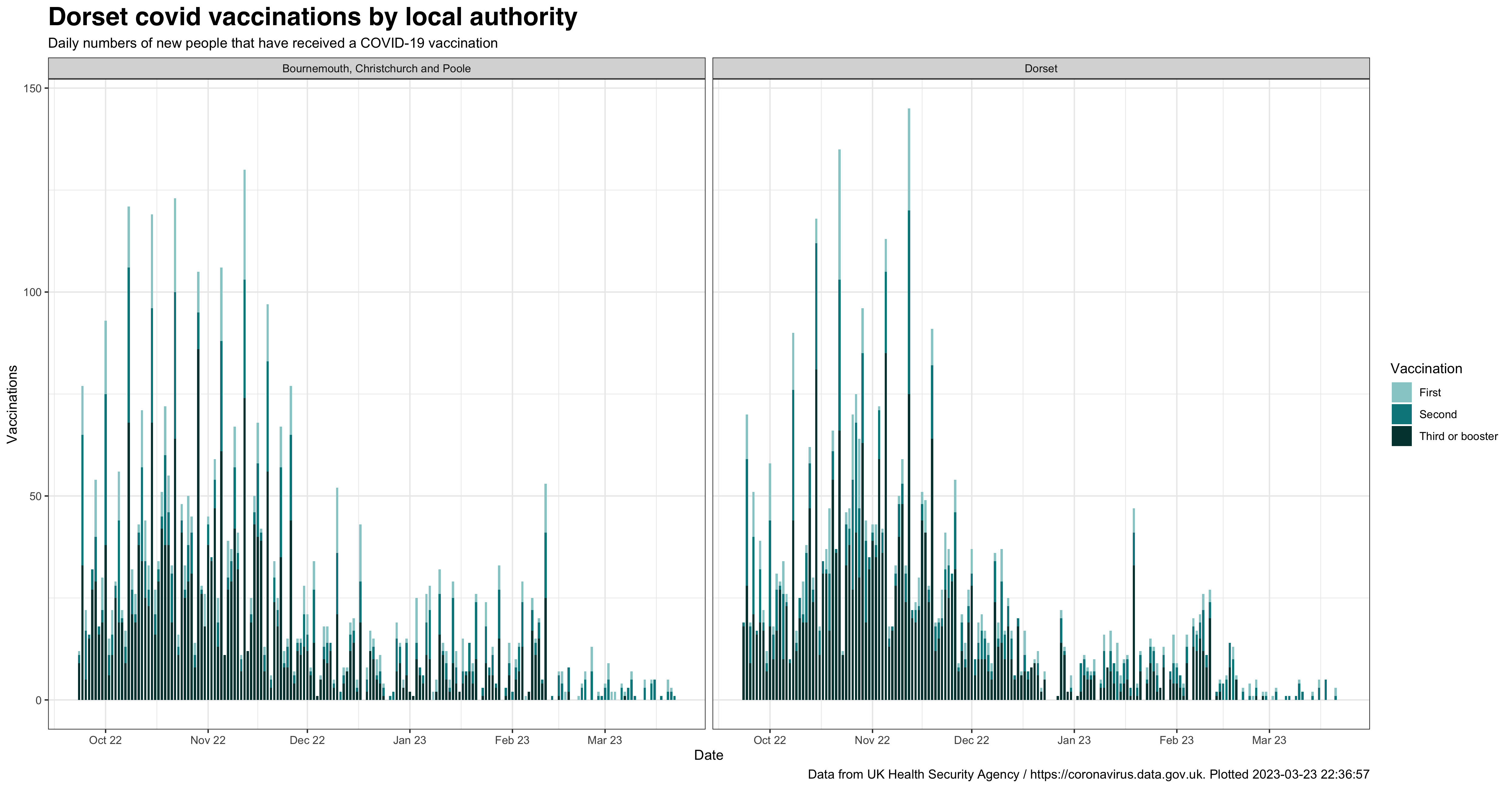
Dorset daily vaccinations
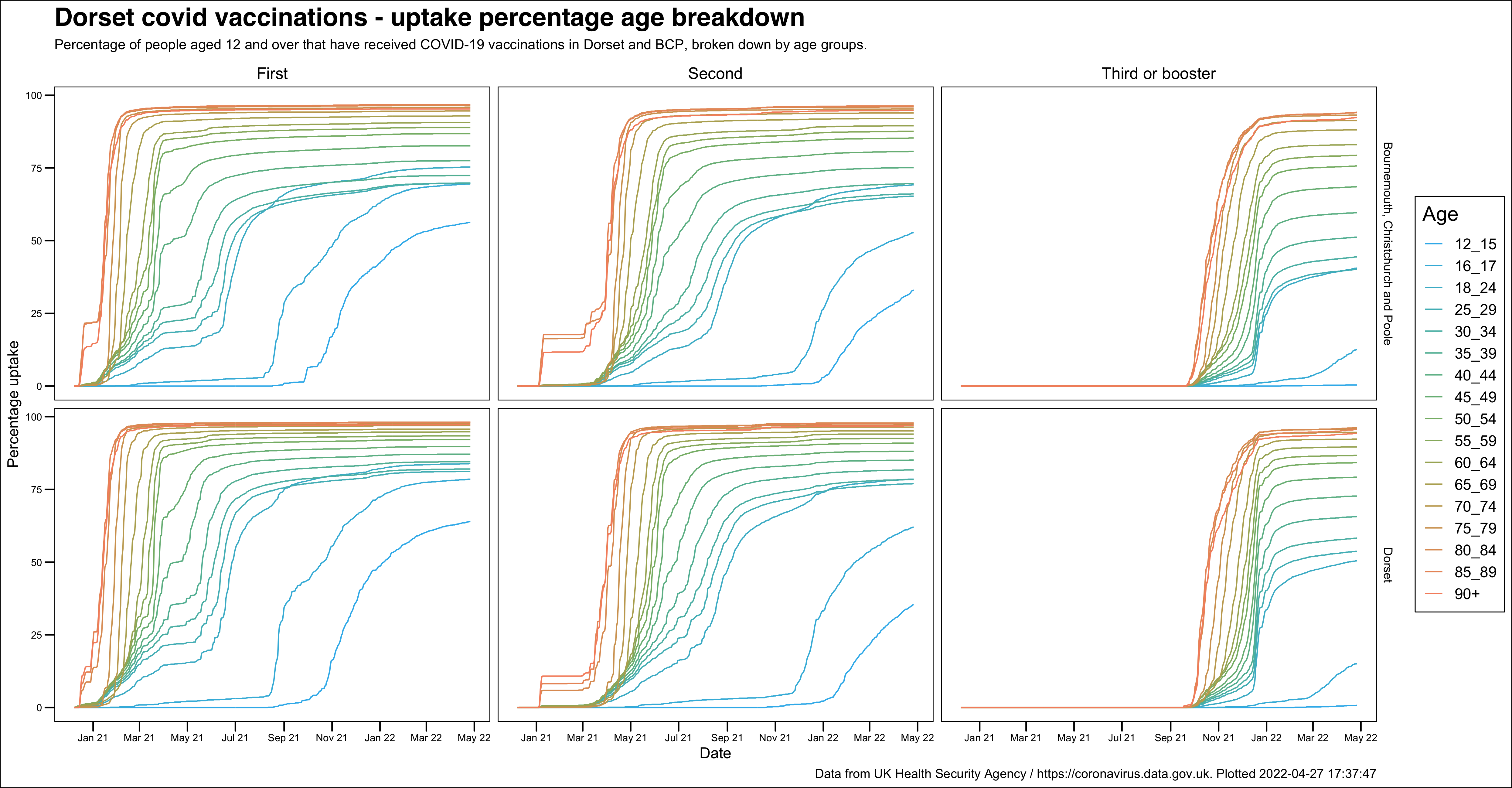
Dorset vaccination uptake as percentage of population
Local authority level uptake

Breakdown by local authority and age group
Dorset Council - MSOA (medium super output area) uptake

BCP Council - MSOA (medium super output area) uptake

Cases
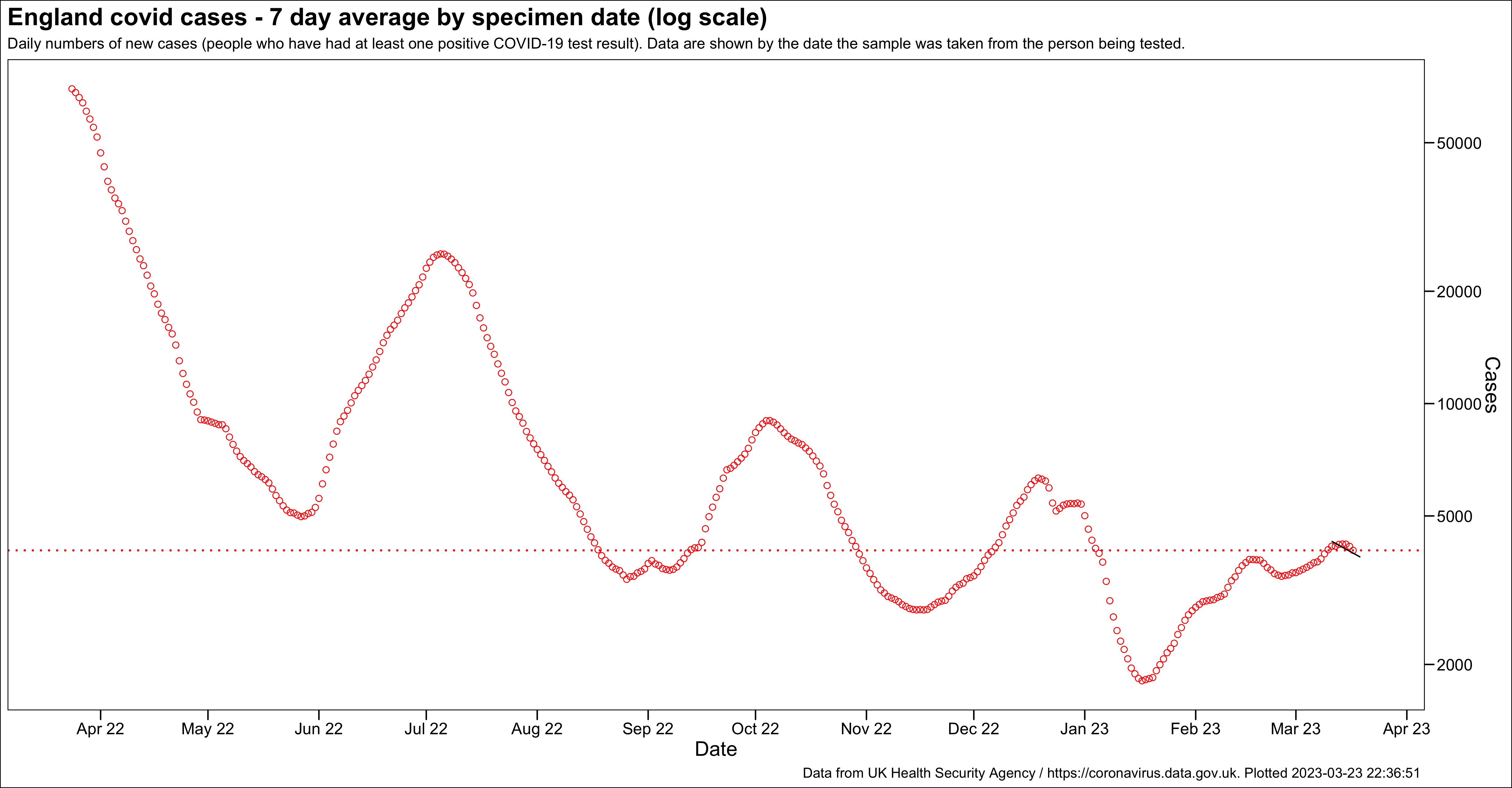
England daily cases
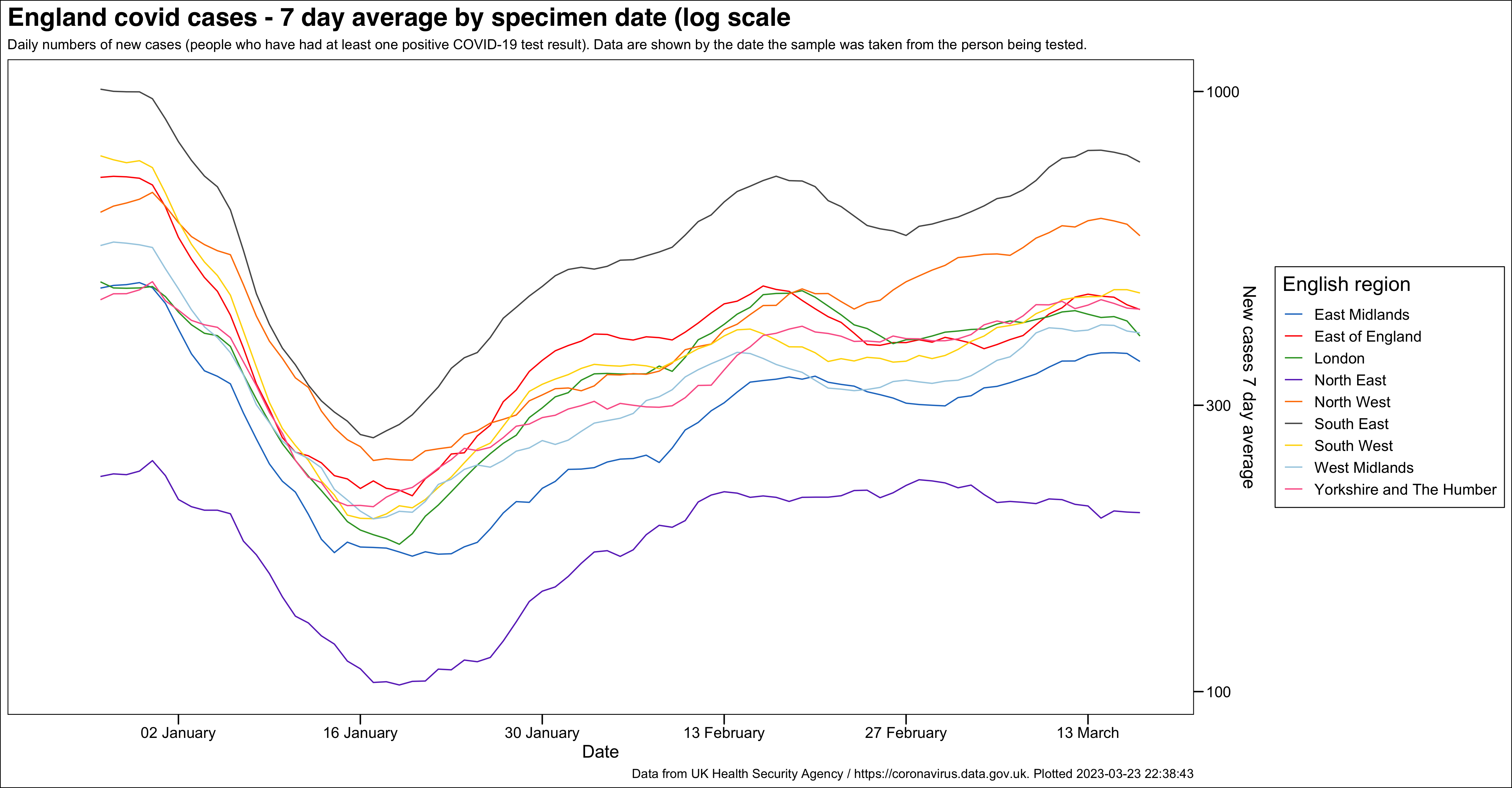
England regions daily cases
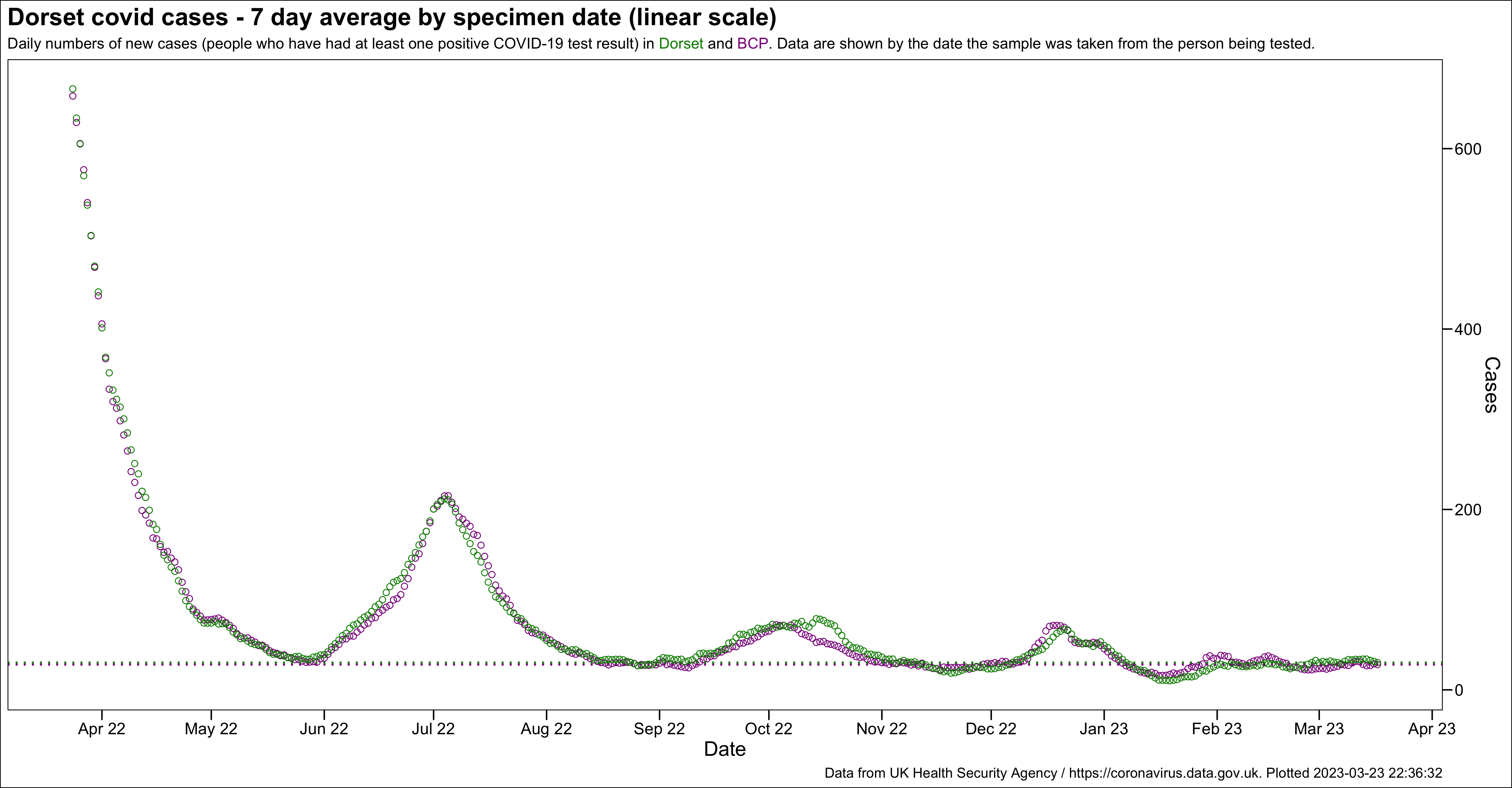
Dorset daily cases
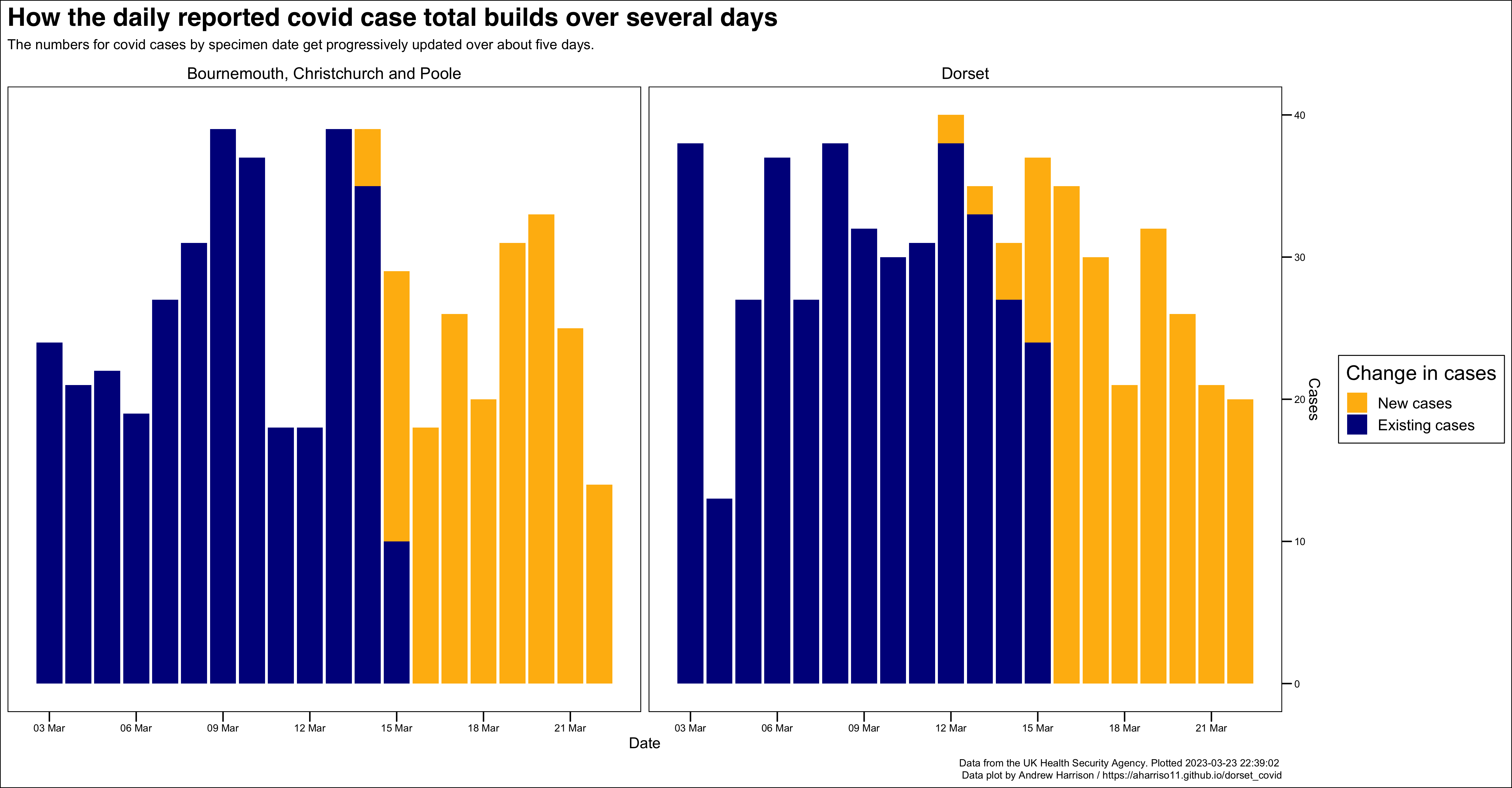
Daily change in Dorset cases by specimen date
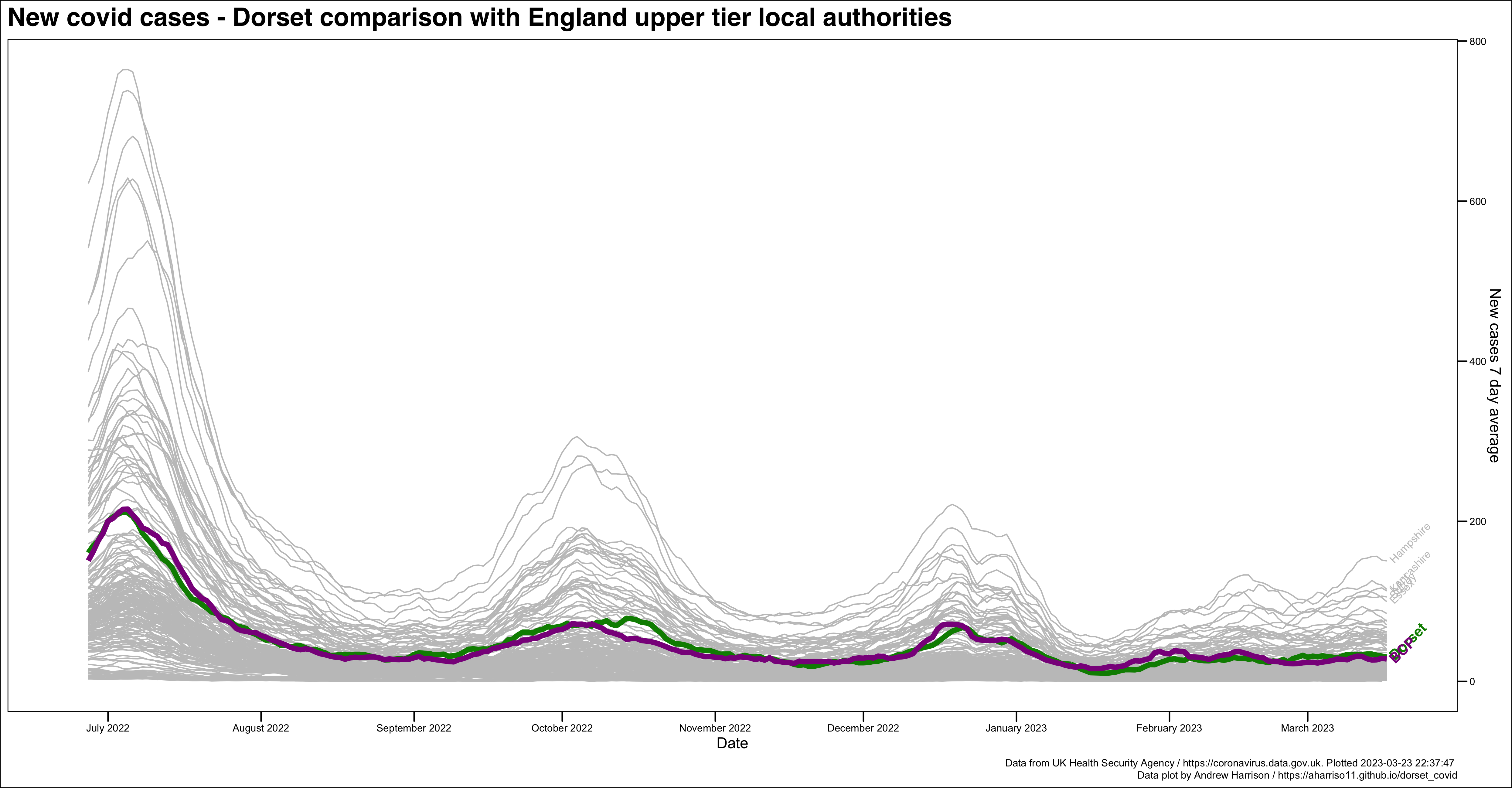
Dorset daily case comparison with other upper tier local authorities
This chart also shows the top five upper tier local authorities
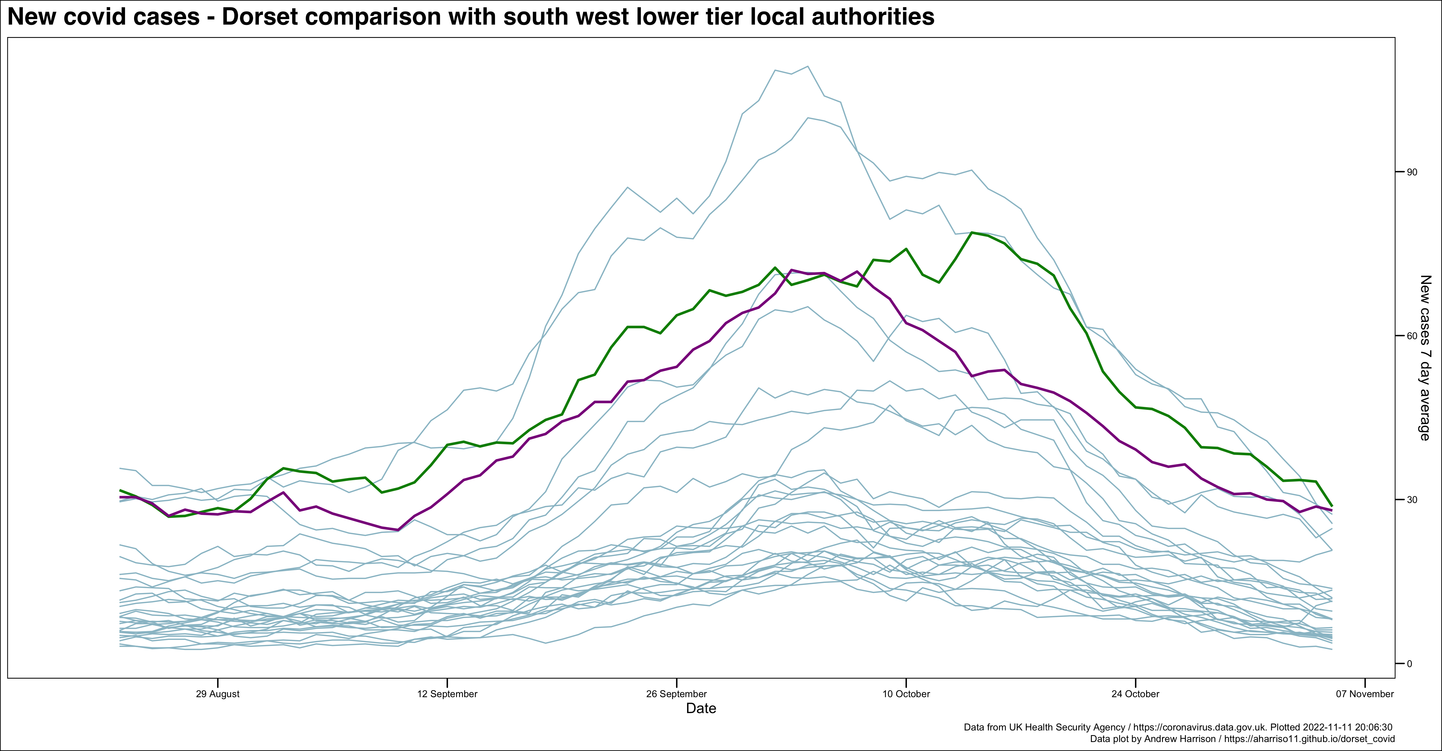
Dorset daily case comparison with south west lower tier local authorities
This chart also highlights LTLAs most affected by the recent Immensa PCR testing failure in red and is presented on this page as a dynamic data plot. You can also view the dynamic data plot at full size on a separate page, or view a static version.
Dorset MSOA rolling rates
A dynamic data plot showing the MSOA rolling rates which can also be seen at full size on a separate web page.
Dorset new cases by age
A dynamic data plot showing the new cases broken down by age which can also be seen at full size on a separate web page.
New cases by age distribution

Testing
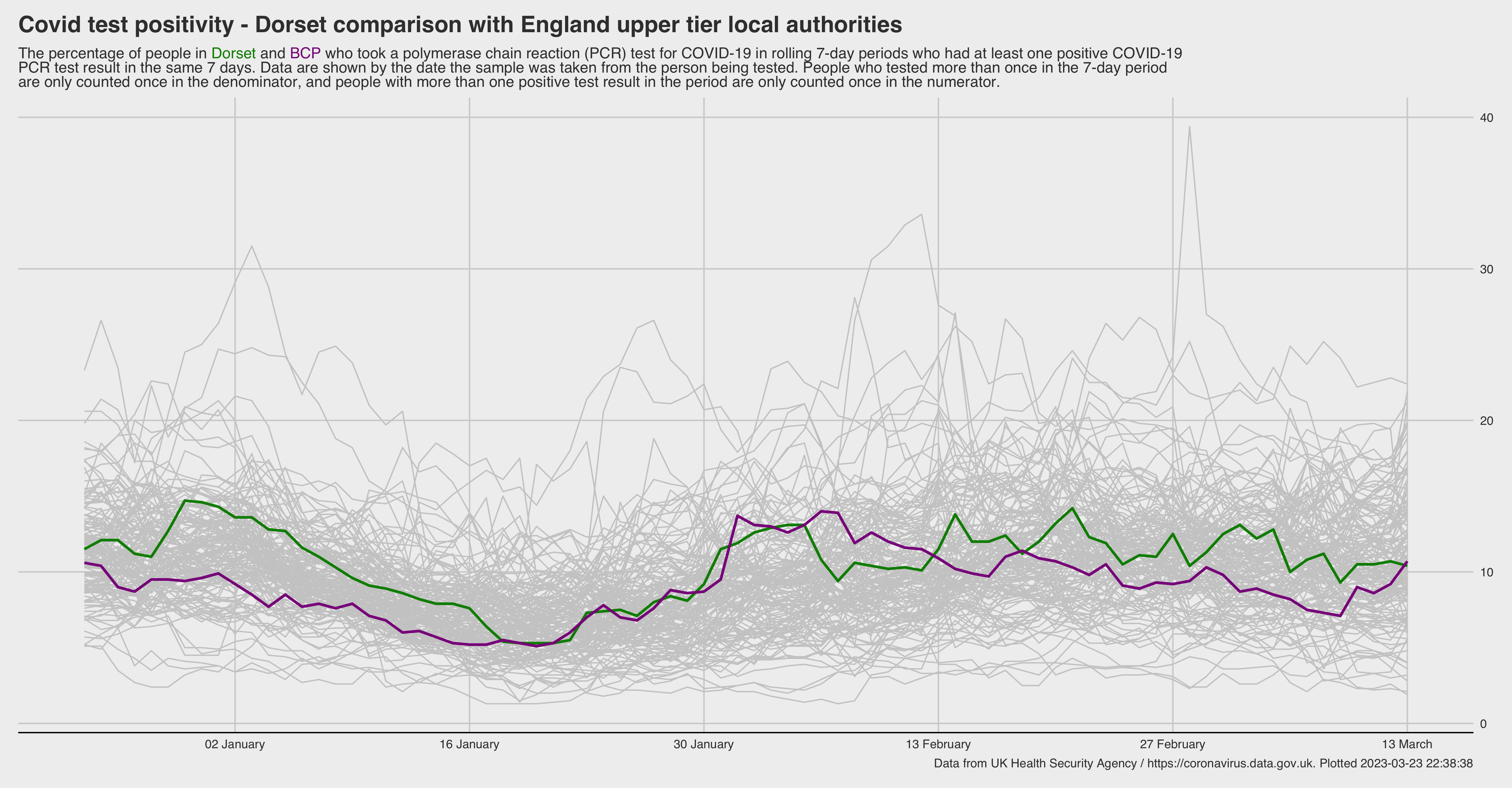
Dorset test positivity comparison with other upper tier local authorities
The metric description of this chart comes from the newly published metrics documentation on the UKHSA dashboard.
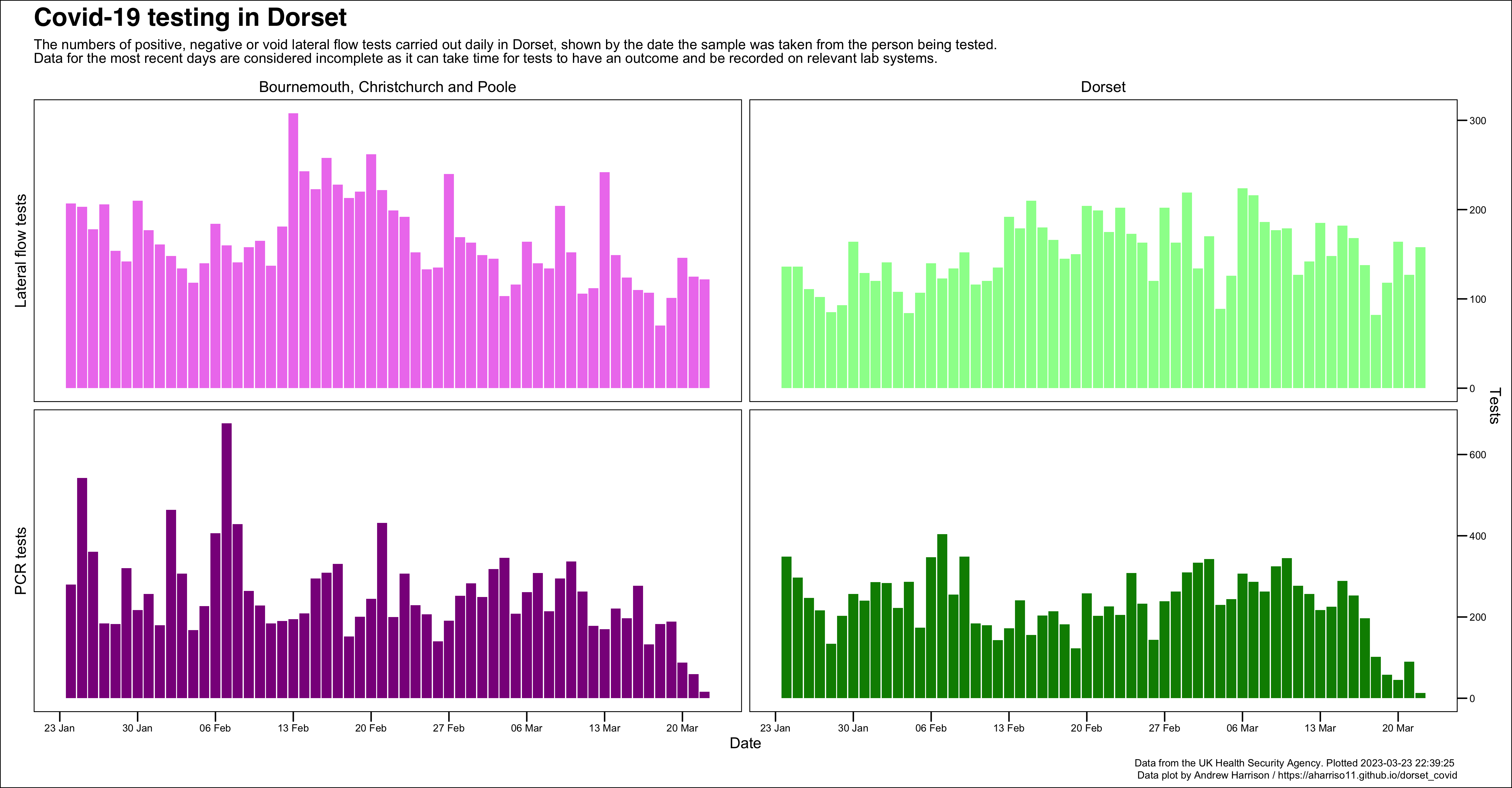
Dorset daily covid tests recorded
This chart shows the number of PCR and lateral flow device tests (both negative and positive) being recorded each day, broken down by local authority. A negative and positive breakdown is not available at local authority level, for more information on testing visit the relevant page of the UKHSA dashboard
Hospital activity
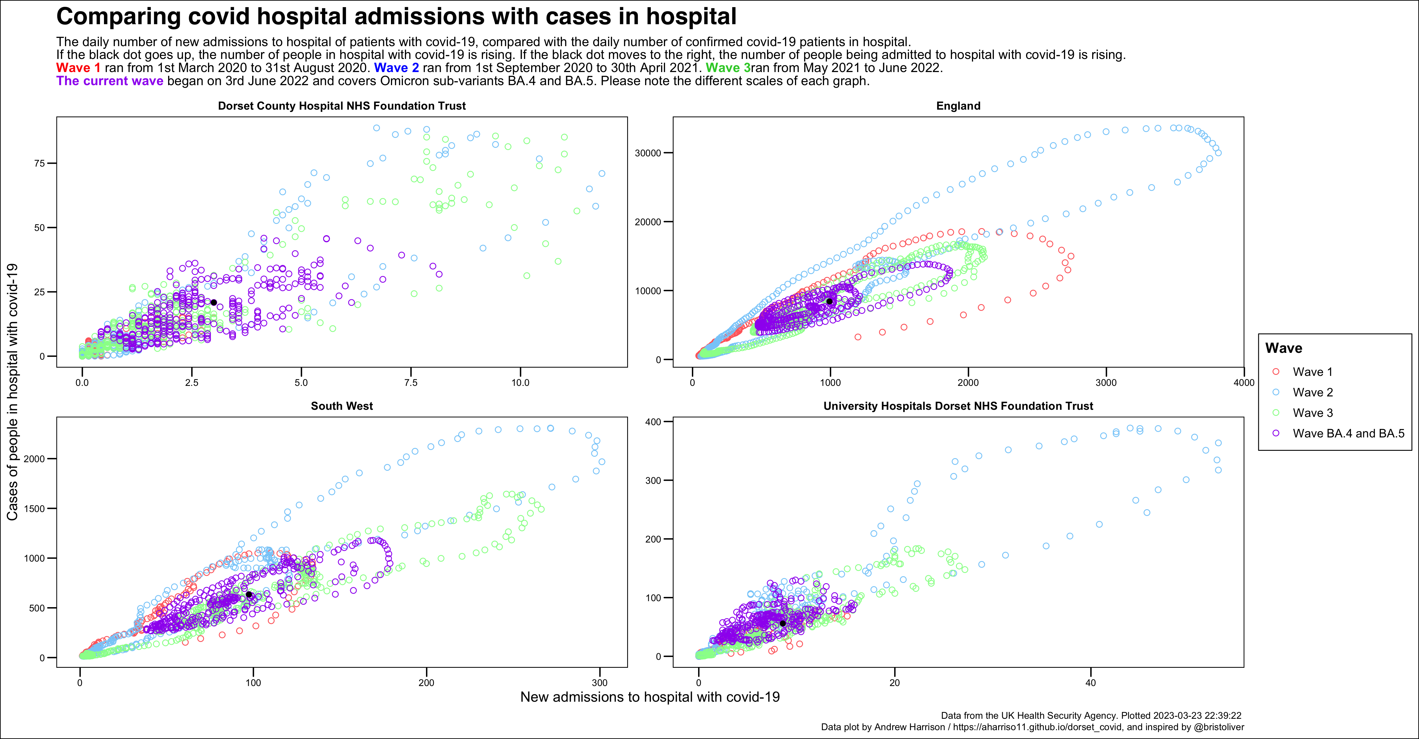
Hospital activity phase portrait
This chart compares new covid-19 admissions with the number of cases in hospital.
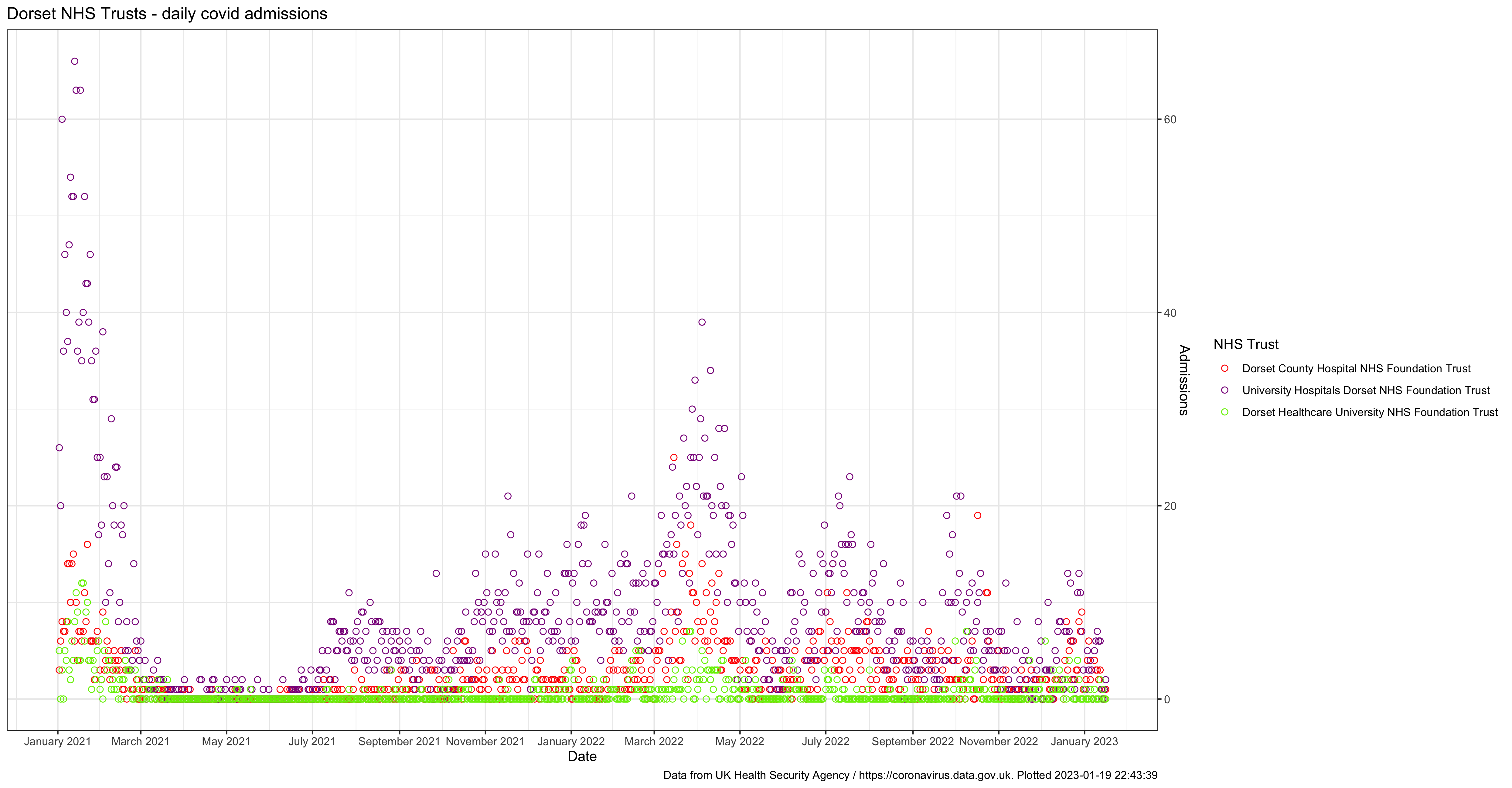
Dorset daily hospital admissions
See NHS trust level data for hospital admissions, bed occupancy and deaths.
The NHS England website provides much greater detail on hospital admissions than either this website or the UKHSA dashboard.